Apr 26, 2011

Large Photo Prints For Cheap


I found this image sometime last year and have seen it numerous times since.
It's Ellen DeGeneres' kitchen (Obviously, the image is from Elle Decor).
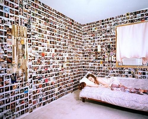
As far as the kitchen is concerned I don't like it; It is too industrial for me, but I do love the photo, and how it is made of many small prints.

It is incredibly easy to do so I had to copy it.

Do me a favor and ignore the shoddy photo quality... And yes, it does bulge out from the wall. Walls where I live are not straight or square. Or flat.

Simply cut/crop a photo into 6x4 pieces using Photoshop or Gimp or whatever you prefer, then take all the images to your local photo printer. Once printed, stick to a sheet of card or thin wood using double sided tape, or mount on paper and frame. Warning: the cropping does take a long time, depending on the size of the picture. Also, don't use spray glue. It doesn't hold very well.

This is a great, cheap method of showing off your photography (or in my case: Photoshop) skills.

Empty Spaces


I love empty rooms. 
They leave you to imagine the possibilities.
For the future.
Of the past.

I'm also loving the crown molding.

Apr 25, 2011

Lest We Forget.


They shall not grow old,
As we that are left grow old.
Age shall not weary them,
Nor the years condemn.
At the going down of the sun,
And in the morning,
We will remember them.
Laurence Binyon


Happy Easter/Anzac day.


Apr 23, 2011

Empty, Ugly AND Full Of Life? No.

"an eclectic collection of Mid century modern iconic chairs bring this dining room to life" 

It really doesn't. At all. I am really concerned about the author's perception of what 'life' in a room is.

I don't like it. I mean I love the light fixture, but it is too low and too small for the room; The mirror is nice but seems... almost lonely; The fireplace is too small for the wall; The grey too dark for the floor and furniture; The chairs too modern (I understand they are meant to stand out in contrast to the room but they are the wrong style) and are too colourful; The standing lamp is alone and the wrong style; The dresser/cupboard thing is also the wrong style (does tie in with the chairs quite nicely though).

In short, the room looks empty and  out of proportion. There is no balance or harmony, and the different styles have no connection with one another.

And that damn ceiling light is too low and too small.

Oh Hai, didn't see you there.

 
INTENSE!

Yea.... I haven't posted new stuff in a loooooong time. Yes this text is annoyingly small so you notice it instead of the absence of an excuse.

Images from http://interiordecline.tumblr.com/
 
↑Top